- Home
- /
- Books & DVD's
- /
- Books
- /
- Lost Art Press
- /
- By Hand & Eye by George R Walker
Lost Art Press
By Hand & Eye by George R Walker


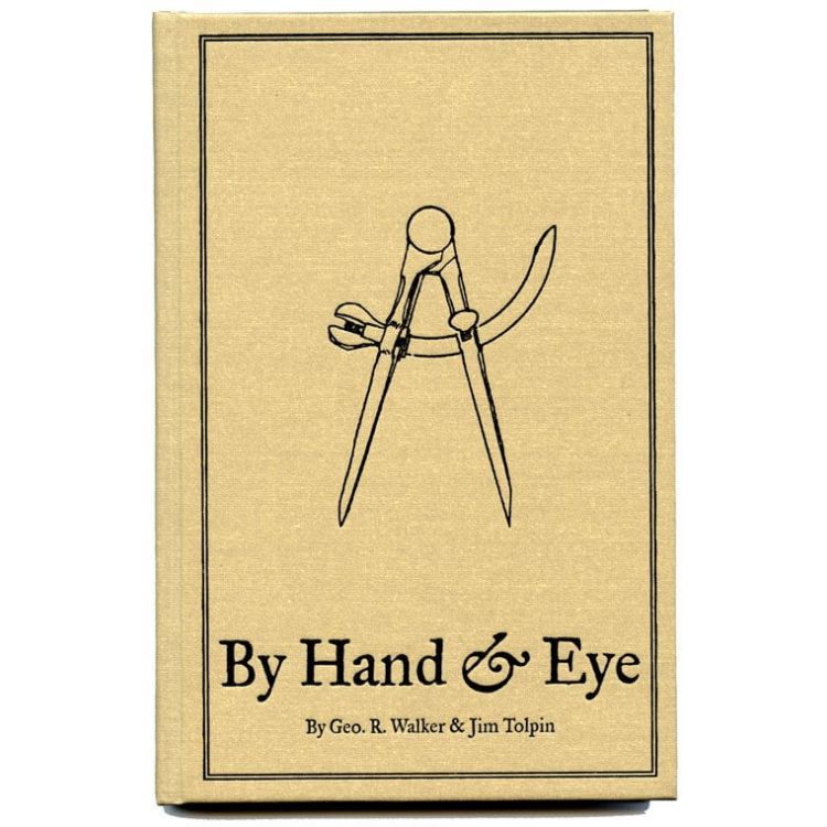
By Hand & Eye by George R Walker is 200 pages long with full-colour illustrations printed on heavy coated paper. The book is case bound and Smythe sewn so it will endure many generations to come. You can download an excerpt for free here.
Instead of serving up a list of formulas with magical names (i.e. the Golden Section, the Rule of Thirds) that will transform the mundane into perfection, George R. Walker and Jim Tolpin show how much of the world is governed by simple proportions, noting how ratios such as 1:2; 3:5 and 4:5 were ubiquitous in the designs of pre-industrial artisans. And the tool that helps us explore this world, then as now, are a pair of dividers.
The key to good design is to master these basic "notes" - much like learning to sing "do, re, mi". How to do this is the subject of the first three-quarters of the book. It offers exercises, examples and encouragement in opening your inner eye, propping it up with toothpicks and learning the simple geometry that will help you improve your design.
The last quarter of By Hand & Eye takes these principles and puts them into practice by designing nine projects that are decidedly contemporary – proof positive that design isn't reserved for highboys and 18th-century Philadelphia side chairs.
The projects show all of the book's design principles in full flower. Yet the projects are small enough and simple enough (for the most part) that you can use them as a way to explore the book's concepts without risking a lot of wood or time in the process.
By Hand & Eye by George R Walker is not, however, a recipe book for better design. The principles of good design are learned through exercise and repetition, and the authors offer critical exercises in every chapter. Reading about good design is not enough to be able to master it. You have to practice it until it becomes second nature and your hand and your eye work together as one.
The hardback boards are covered in cotton cloth with a black matte stamp. Real Old School.
Like all Lost Art Press books, By Hand & Eye is produced and printed in the USA.
About Lost Art Press:
Lost Art Press LLC was founded in 2007 by two enthusiastic woodworkers, John Hoffman and Christopher Schwarz, while attending a Lie-Nielsen Toolworks Open House in Warren, Maine. The company started with a question: What happened to all the great woodworking books that used to be published? The books that changed the course of the craft and people’s lives? The books that explored our ever-diminishing link to the handwork of previous centuries? Flash forward to today, Lost Art Press ships about 60,000 books a year, which makes them still a tiny publisher in the grand scheme of things, but allows important, valuable texts to be produced, fairly and equitably for generations to come. As a family business ourselves, we absolutely love the principles and foundations that Lost Art Press is built upon, and proudly stock a large range of their books.


